Cartography & Visualization

How Greenpeace is Fighting Big Oil with Data Visualization
Greenpeace is transforming idea into action by using data visualization to show the concrete danger that petrol poses.

Design Principles for Making Maps on the Web
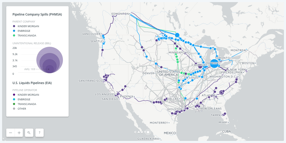
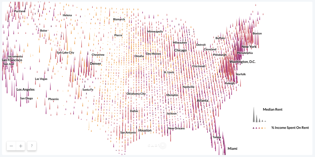
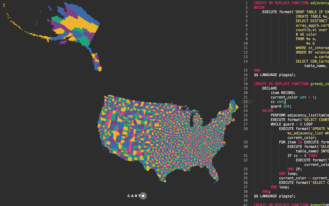
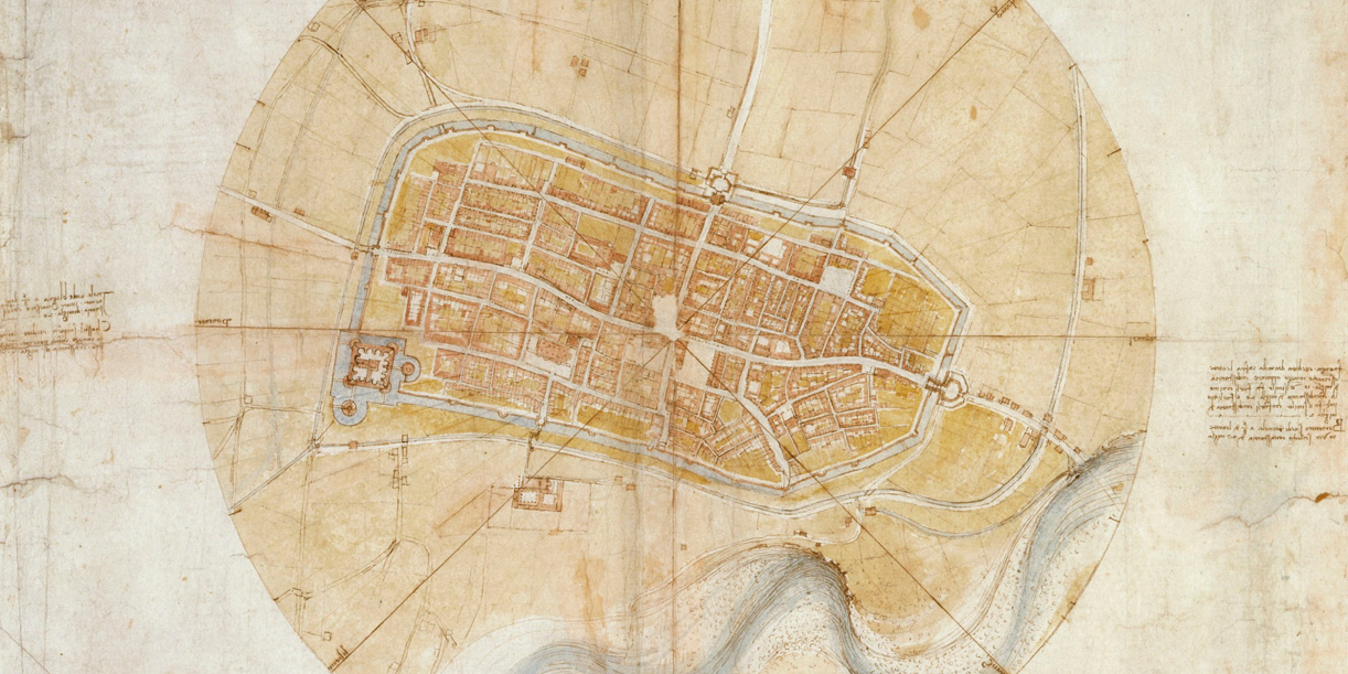
Unless you're Leonardo da Vinci, being both an artist and a scientist doesn't come naturally, so we've found two maps that demonstrate how colors, labels, boundaries, and symbols can help you create a powerful map.

CARTO 2018: Our Year In Review
From start of year roadmaps to end of year industry recognition, here’s a brief recap of our very busy 2018!

Aggregating data for faster map tiles
Map tiles can be speedup for larga data sets by using aggregation

A SQL approach to graph coloring applied to maps
How to solve the graph coloring problem implementing several map coloring algorithms in PostGIS

A new look for Positron and Dark Matter basemaps
Positron and Dark Matter have been redesigned with their original purpose in mind.

80 Data Visualization Examples Using Location Data and Maps
We've scoured the web in search of data visualizations showing the value of location data in its many varieties, and have compiled this list to bring you the very best examples.

4 solutions to common problems when making location data maps
Learn four tips on solving common cartography problems using CARTO VL, CARTO.js and Builder

4 Powerful Historical Maps Every Data Analyst Should Know
These four historical maps reveal that innovations in a map's perspective, data, and aesthetics all contributed to the complex five-decade evolution of location intelligence.

